Gran Valtravieso
Moorland Wine
The new Gran Valtravieso design is an expression of authenticity from the terroir it was born in.
The high limestone moors in Piñel de Arriba —at an altitude of over 915 m above sea level— produce a wine that is elegant, serious and profound. Three traits that also define the design of all these elements.
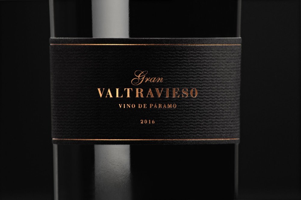
The style of the different pieces that make up the design system is guided by this concept of projecting an apparently sober, but essential beauty: in fact concealing a great richness and complexity on the inside.
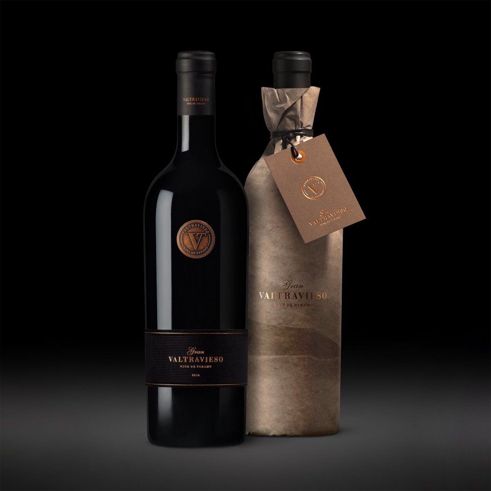
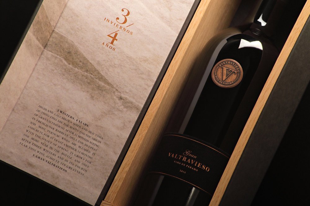
Thus, the bottle is presented in 2 versions: first, in a paper wrapping that reproduces the chalky texture of the mineral component in the soil. In this format, the tag identifies the winery and below the “3 winters/4 years” formula explains what makes Gran Valtravieso a unique wine.
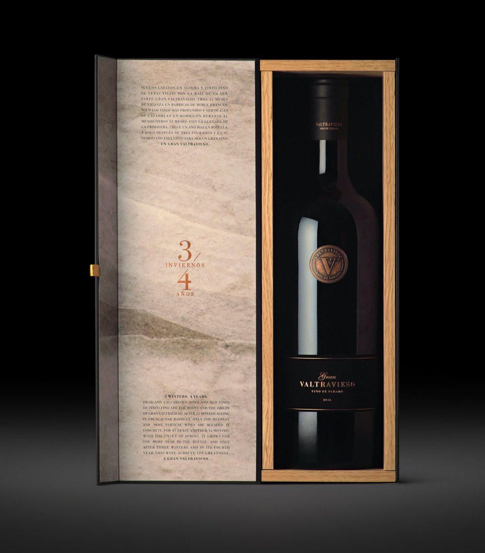
The other packaging chosen to protect the bottle is an individual case. It features black cardboard and wood, identified only on the outside by the winery's logo and the wine's name. When opened, the mineral limestone texture is revealed on the inside of the box door with the text “3 winters/4 years” on top.
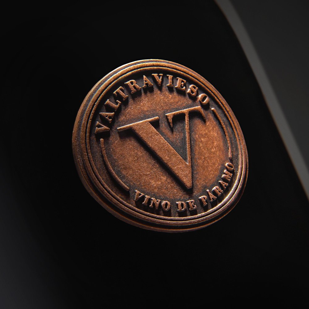
The tronconical-shaped Bordeaux bottle projects a powerful presence. Between its shoulders, a circular copper-hued metal seal becomes, with a pronounced relief, the focal attention point. The overall sensation is a balanced, premium design that leaves no doubt about the high value of the wine it contains.