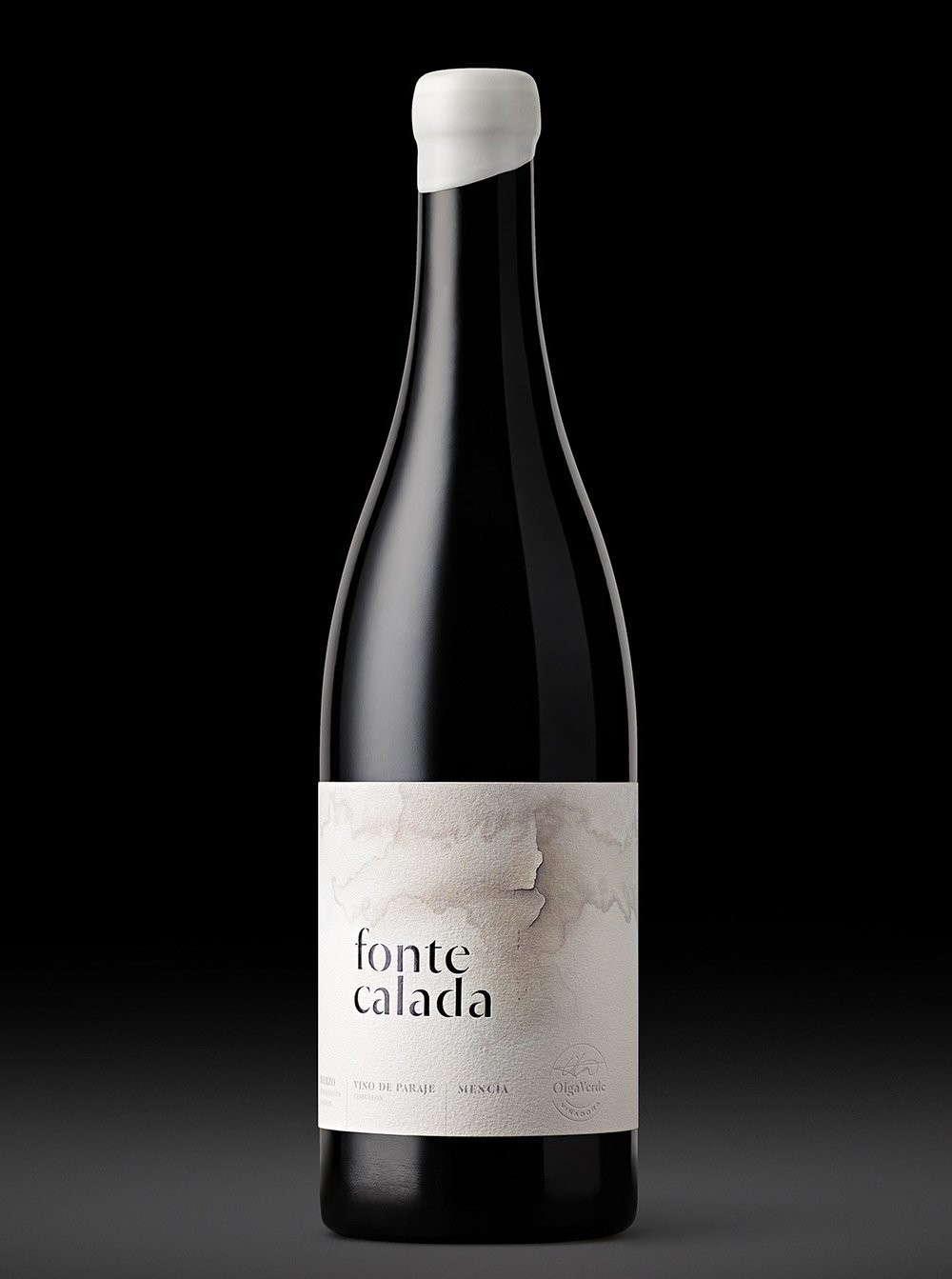
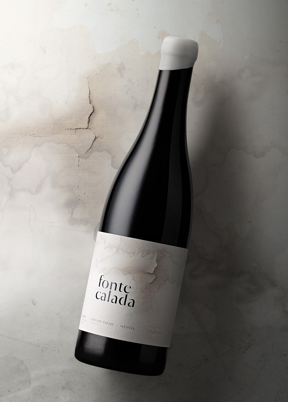
FONTECALADA
Site-specific Vineyard Wine
Bronze Winner — Pentawards 2023
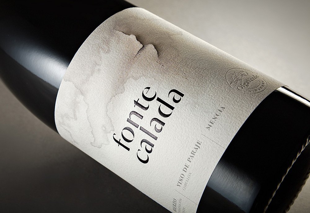
A work that visually emphasises the name of a unique vineyard
Its meaning: “a spring in calcareous soil” conveys the distinctive mineral character of the terroir for this signature wine.
The area, a land where calcification ovens used to exist in past times, accommodates the plot where Olga Verde, the artisan winemaker, grows this Mencía grape variety.
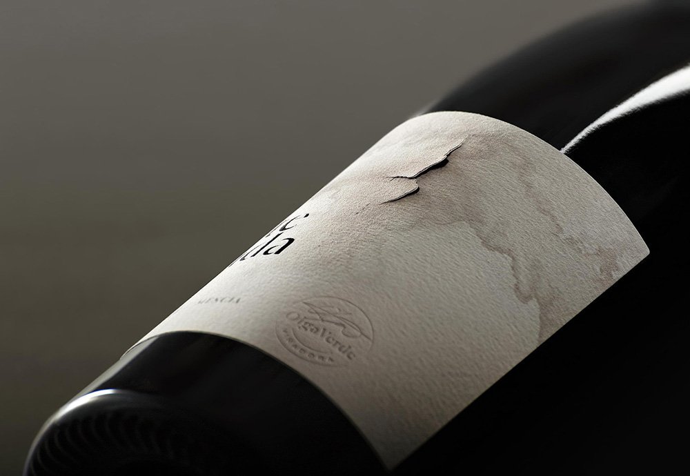
We sought an a depicting and profound way to express these concepts
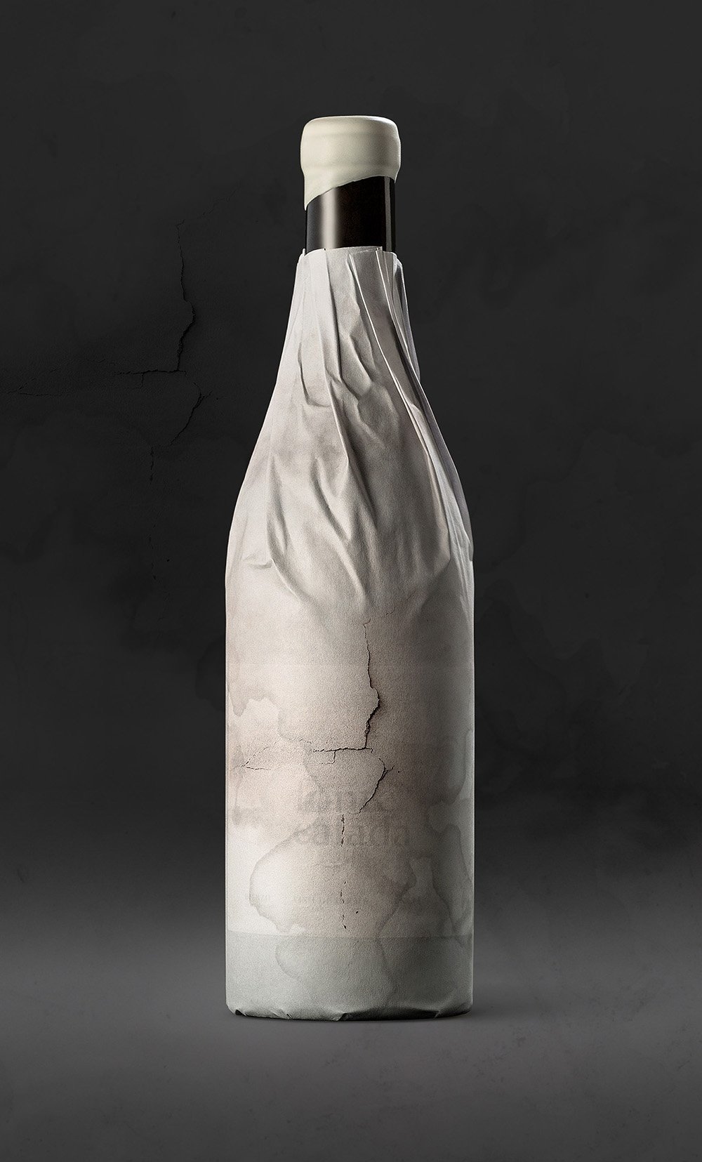
As part of the finishing process, our printing partners accepted the challenge of creating a literal crack in the label —in the same place it appears on the design. The process was done manually for this limited edition red wine, with the added difficulty of canceling the adhesive in the area under the tear, something that also involved a creative approach.
Based on this suggestive and subtle image, the result is both intriguing and representative of this type of winemaking: one in which the uniqueness of the vineyard, its composition and its history create an evocative narrative that is already attracting connoisseurs to buy it.